Adjusting Color and Light
The Color and Light section of the Image Ribbon contains many options that allow you to fine-tune your photos or images to blend in better with your page design and color scheme, or to "pop" and call attention to the image.
Steps to adjust the color and light settings of a photo or image:
- Select the photo or image on your page.
- Click the Image Ribbon.
- Click on the desired menu option:
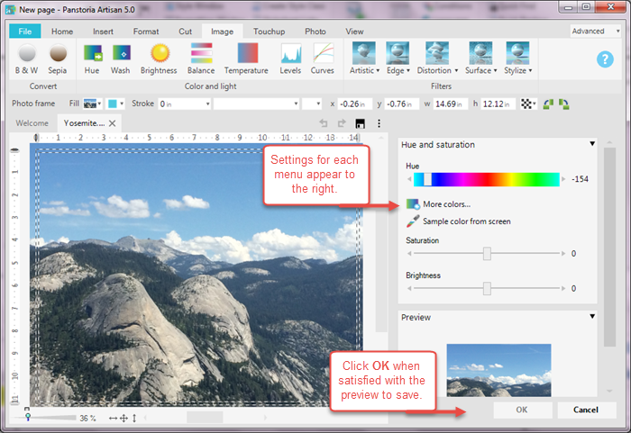
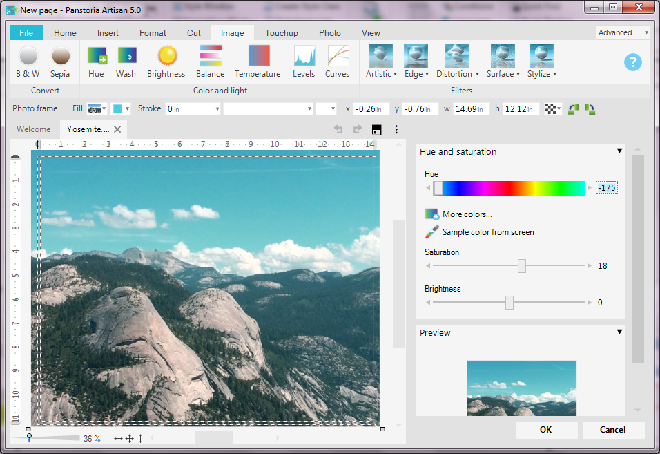
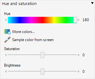
Hue and Saturation
In simple terms, a hue is a true color on a mixing wheel or rainbow (e.g., red, orange, yellow, green, blue, violet). Colors in images can be adjusted so that reds are more orange-red, and greens more blue-green.
Saturation can be thought of as a range from pure color (100%, vivid) to gray (0%, dull).
We have all heard the term, "a picture does not do it justice." The hue and saturation levels of colors that we experience in nature is hard to replicate in a photo. Artisan gives you these tools to allow you to get the colors in your photos or images to look their best!
|
Settings |
Description |
|---|---|
|
Hue |
Click and drag the slider across the color spectrum to effect the overall hue of the image.
|
|
More colors |
Invokes the Color Picker so that you can choose a hue from the palette. See the section Using the Color Picker for more information about the color picker. |
|
Sample color from screen |
Uses the dropper tool to allow you to "pick up" a color from the image to use as the hue model. |
|
Brightness |
Adjusts the overall lightness or darkness of the image. |
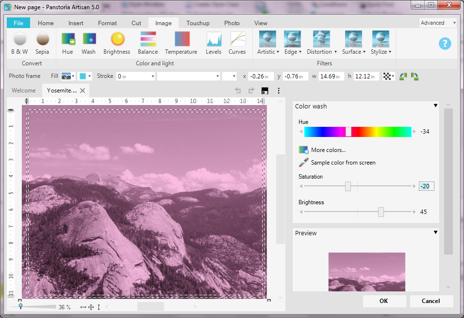
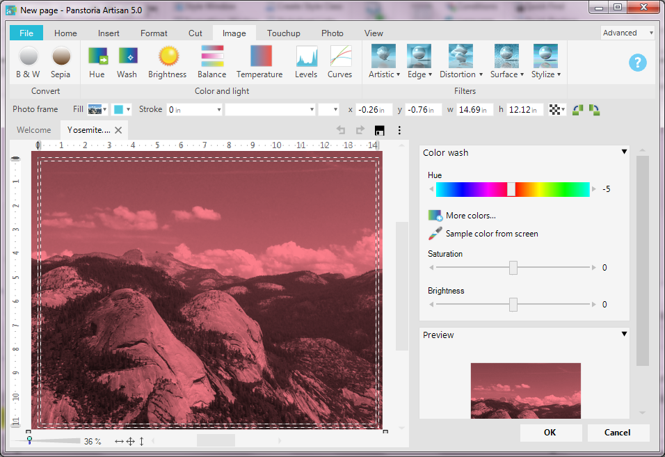
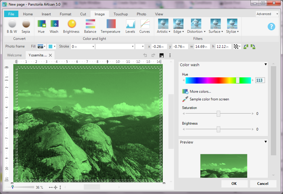
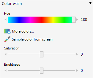
Color Wash
You can add a wash of color over your entire image, adding a creative touch and possibly either make the image blend in with the page's color palette, or making it "pop" by using a contrasting color. You can even create an "Andy Warhol" effect by having a page of copies of the same image with multiple washes!
|
Settings |
Description |
|---|---|
|
Hue |
Click and drag the slider across the color spectrum to effect the overall hue of the image.
|
|
More colors |
Invokes the Color Picker so that you can choose a hue from the palette. See the section Using the Color Picker for more information about the color picker. |
|
Sample color from screen |
Uses the dropper tool to allow you to "pick up" a color from the image to use as the hue model. |
|
Brightness |
Adjusts the overall lightness or darkness of the image. |
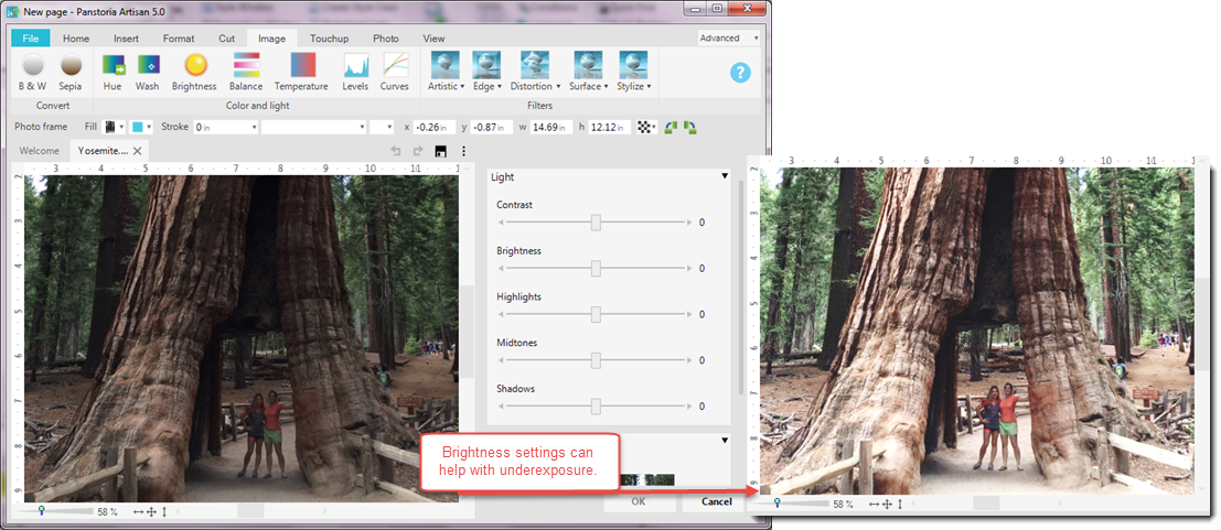
Brightness
The amount of light in your image can be adjusted with the Brightness settings. This can be helpful to brighten or darken a photo that was underexposed or overexposed.
|
Settings |
Description |
|---|---|
|
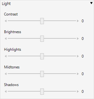
Contrast |
Adjusts the difference between light and dark areas of an image. Contrast determines the number of shades in the image.
|
|
Brightness |
Adjusts the relative lightness and darkness of an image, determining the intensity of colors. |
|
Highlights |
Adjusts the brightest parts of an image. |
|
Midtones |
Adjusts the overall lightness or darkness of the image. |
| Shadows | Adjusts the darkest parts of an image, and the degree of detail that is discernible in those dark portions. |
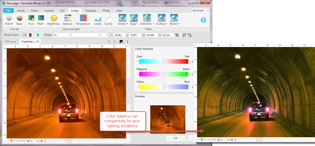
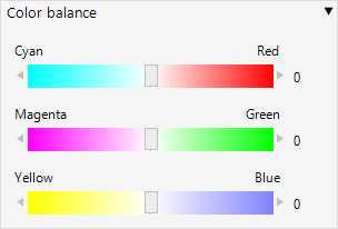
Balance
You can adjust the color balances of your image. For example, sometimes pictures taken indoors with a flash can appear washed in yellow or orange. With the Balance menu, you can balance one hue to it's complimentary hue; cyan/red or yellow/blue to achieve a color more true to the original subject.
|
Settings |
Description |
|---|---|
|
Color balance |
Each slider is balanced between two complimentary hues.
Click and drag each slider and watch the preview for the desired change. |
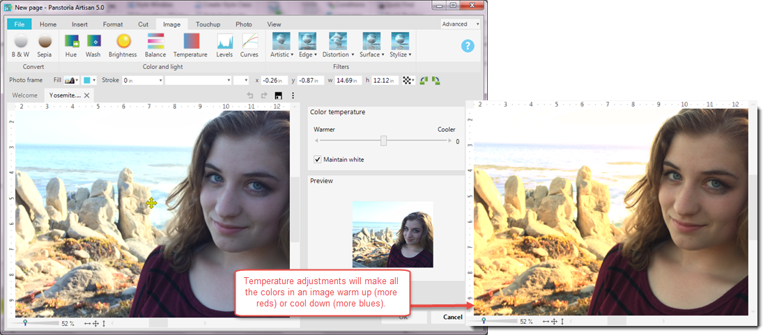
Temperature
An image's temperature is the amount of warm colors (reds/yellows) versus the amount of cool colors (blues/purples) that the image displays overall. The Temperature menu is much like changing the color balance of the image, without the guesswork. This feature is nice when skin tones in a photo look too pink or too blue.
|
Settings |
Description |
|---|---|
|
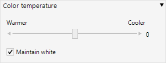
Color temperature |
The slider is balanced between warm and cool.
Click and drag the slider until the preview has the desired look. |
| Maintain white | Leave checked (on) to keep the white from adjusting. |
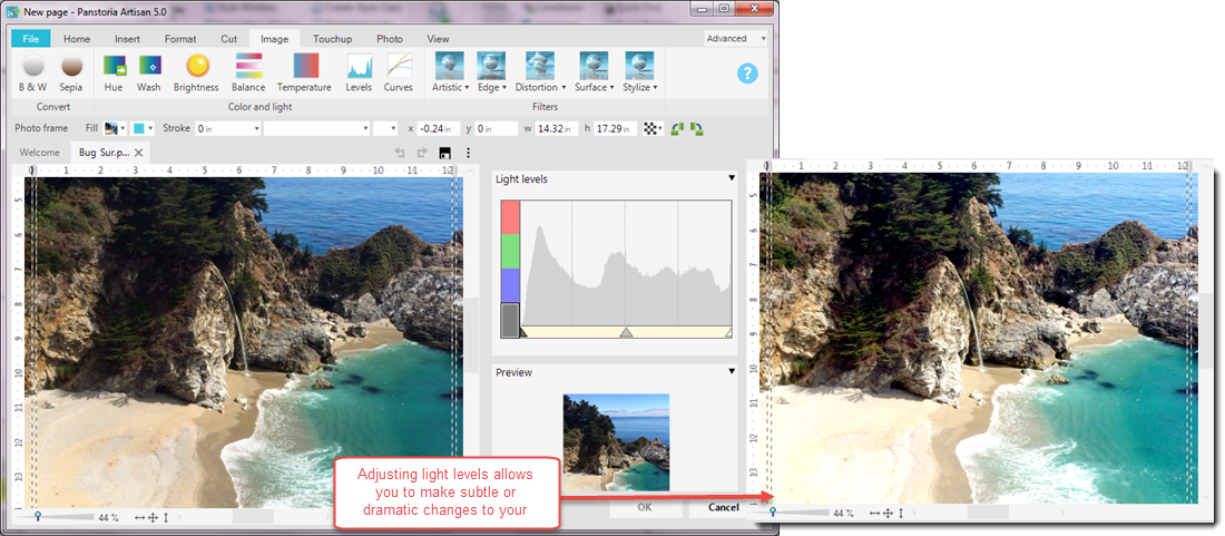
Levels
Sometimes an image appears too dark or too bright. If you want precise control over the adjustment, use the Levels menu.
|
Settings |
Description |
|---|---|
|
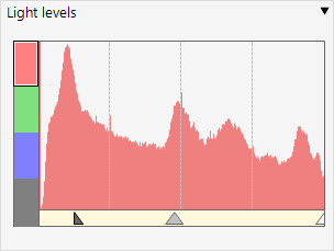
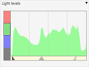
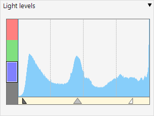
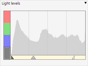
Light levels |
The light levels interactive diagram shows you the levels of light for each of the color hues (red, green, and blue). Just click each block to see the light representation for each hue (the gray block effects all hues):
The sliders appear at the bottom of the diagram as triangles: Click and drag the triangles (the middle one can move independently) until your preview has the desired look. |

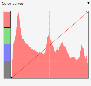
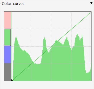
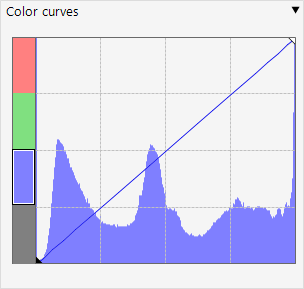
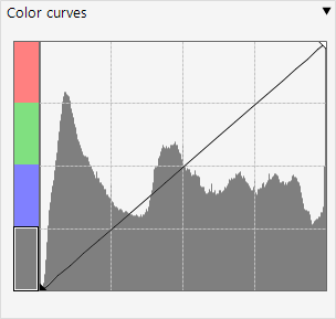
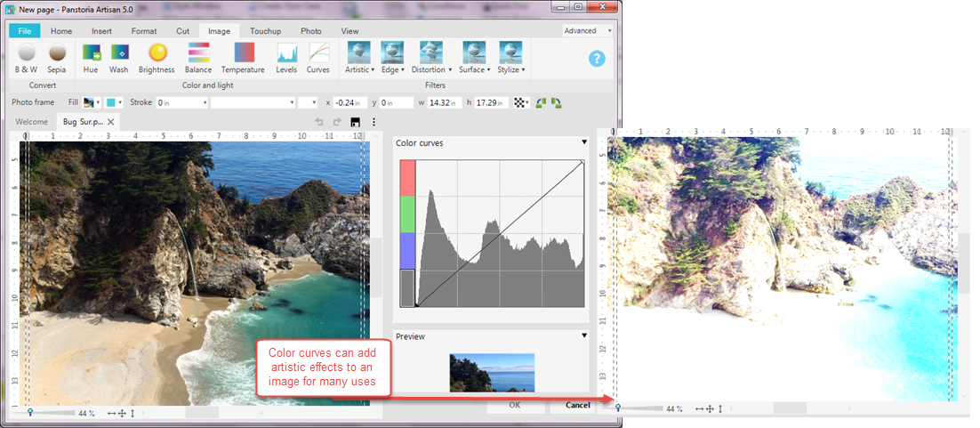
Curves
The Color Curves menu intensifies or fades overall color in an element. Using curves achieves an overall shift in shadows, midtones, and highlights. This feature is fun to play with for creative touches like fading out an image to serve as a background layer or border.
|
Settings |
Description |
|---|---|
|
Color curves |
The color curves interactive diagram shows you the levels of color intensity for each of the color hues (red, green, and blue). Just click each block to see the color intensity representation for each hue (the gray block effects all hues):
Click and drag on the line - curving the line horizontally and vertically- until your preview has the desired look. |